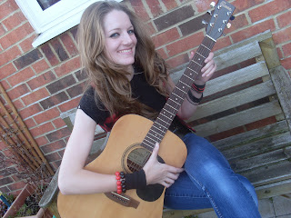
This is my final version of my music magazine Chamber
Welcome!
Welcome to my blog, enjoy and just have a look around :D
9 December 2010
8 December 2010
Magazine Research
I did some research on Kerrang! magazine as it is similar to Chamber. This presentation shows Kerrang!'s history and how it has rose over the years.
16 November 2010
Reader Profile...
This reader profile sums up the results from my questionnaire. The images placed on this represents the type of person that my target audience is.
However, somethings I chose not to put on my readership profile, one of them is the social grade that I would class my audience as. The social grades my target audience would be associated with range from B-D but I think overall my audience will either be C1 or C2.
Another subject that I didn't mention on my profile was Psychographic Profiles. I believe that my target audience would be a belonger, an emulator/wannabe and are socially conscious type B. This basically makes them belong to a community or social group, someone with an identity; wants to be an achiever, they will do anything to try and make themselves look like an achiever with a goal of attracting the opposite sex or gaining approval from their peers. Finally, being apart of socially conscious type B means that they have given up on humanity and has moved off into their own social group and or community.
4 November 2010
2 November 2010
Magazine Flat Plans...
Here I have created a basic outline of how I could lay my magazine out.
6 c flat plans 2
View more presentations from QueenOfMarshmallows.
6 c flat plans 3
View more presentations from QueenOfMarshmallows.
House Style...
NME: It uses a series of red, yellow, white and black that continues through the magazine. The way they have used this colour scheme on this copy is very bland and doesn’t seem very lively. I think there is too much blank space and too much white. It seems to obvious that the colour scheme is red and white, these two colours seem to over power the magazine and you don’t seem to notice the yellow and black so much.
PME: This magazine has decided to go with a slightly different colour scheme to the normal conventional colours. The colours don’t seem to go very well together; however, the colour scheme is consistent throughout the magazine. The placing of text could have been chosen more carefully and I think the effects that have been used on the photographs don’t follow the codes and conventions of magazines.
Kerrang: Kerrang once again follows the conventional colour scheme of red, yellow, black and white. On this copy they have focused more on the black, white and yellow. Their layout is busy but they have organised it so it has some form of structure. Their uses of photographs are effective as they use them as backgrounds or place numerous photos to cover any blank space.
Real R’n’B: This magazine follows the conventional colours of red, yellow, white and black however the distortion of the photographs makes it less conventional. However, the layout of the magazine is good as it is busy and makes it seem like there is a lot going on in the magazine and that it is worth the money. But I have noticed that the page numbers are slightly too big.
Rolling Stone: Once again this follows the conventional colour scheme of red, yellow, black and white. This magazine focuses more on text than photographs and images. It seems to only place images if they relate to the text. The text suggest that its audience is the older male.
Conclusion: I would aim for the same type of layout and colour scheme that Kerrang uses as it seems the most powerful and its pretty close to the target audience that I am going for.
1 November 2010
Music Magazine Photo Shoot...
These are the photographs that I took for my Music Magazine. The majority of them can be used as front covers slong with some of them being for suitable for either the contents page and/or double page spread.
Subscribe to:
Comments (Atom)


